The brief
What they asked for, and what we built.
What the client wanted
An identity for an online store that would feel approachable and human, stand out in a category full of cold blue tech marks, and still read clearly as a marketplace app icon.
- Warmth rather than the usual tech blue
- A symbol that works as an app icon
- A palette wide enough for category badges
What we did
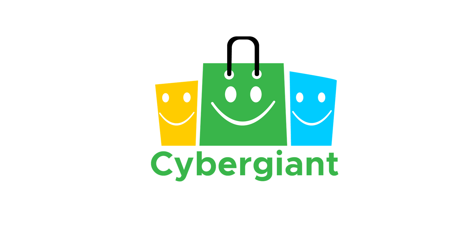
We drew three shopping bags as faces, the middle one carrying the full smile, so the mark reads as a shopfront and a group of happy customers at the same time. The centre bag alone works as the app icon.
- Three-bag mark with the centre bag as a standalone icon
- Green, yellow and blue palette for category colour coding
- Lowercase wordmark for an approachable tone
- Transparent version for placement over product photography
Related
Want the same for your business?
This was a logo design project. For online retailers we also build the eCommerce store and run Google Shopping campaigns.