The brief
What they asked for, and what we built.
What the client wanted
A logo for an international cargo operation that signals speed and reach without resorting to the usual globe and container cliches, and that survives being stamped on an air waybill.
- A wordmark that stays legible at small sizes
- A symbol that can stand alone as an avatar
- Versions for light and dark backgrounds
What we did
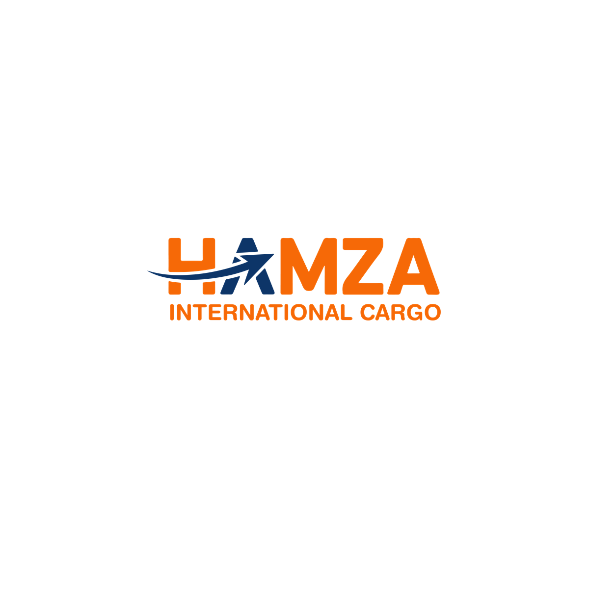
The A of HAMZA is cut into an aircraft climbing away from a swept flight path, so the symbol and the wordmark are the same drawing rather than a mark placed beside a name.
- Primary horizontal lockup with the descriptor
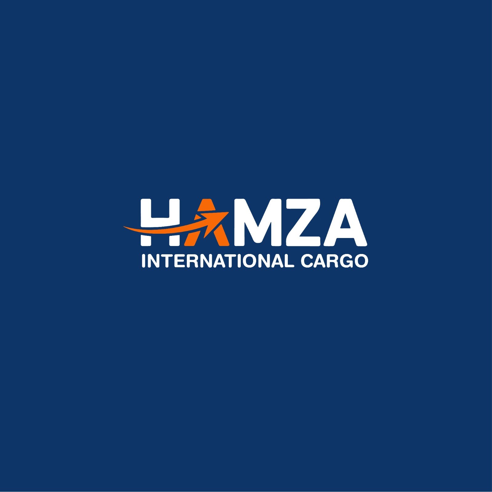
- Reversed colourway for navy and photographic backgrounds
- Standalone arrow icon for avatars, favicons and app tiles
- Orange and navy palette carried across the set
Related
Want the same for your business?
This was a logo design project, part of our design and branding service. The social and campaign creative built on this identity is a separate case study.