The brief
What they asked for, and what we built.
What the client wanted
A single identity that would hold together across every place the business appears, from a card handed over at a job to a van seen at speed on the motorway.
- A mark that stays readable when it is small
- Colours that survive print and vinyl
- Something that reads as a trade business, not a tech startup
What we did
We drew the mark against its hardest constraint first, the smallest size it would ever appear at, then scaled up rather than down.
- Primary, stacked and single-colour logo variants
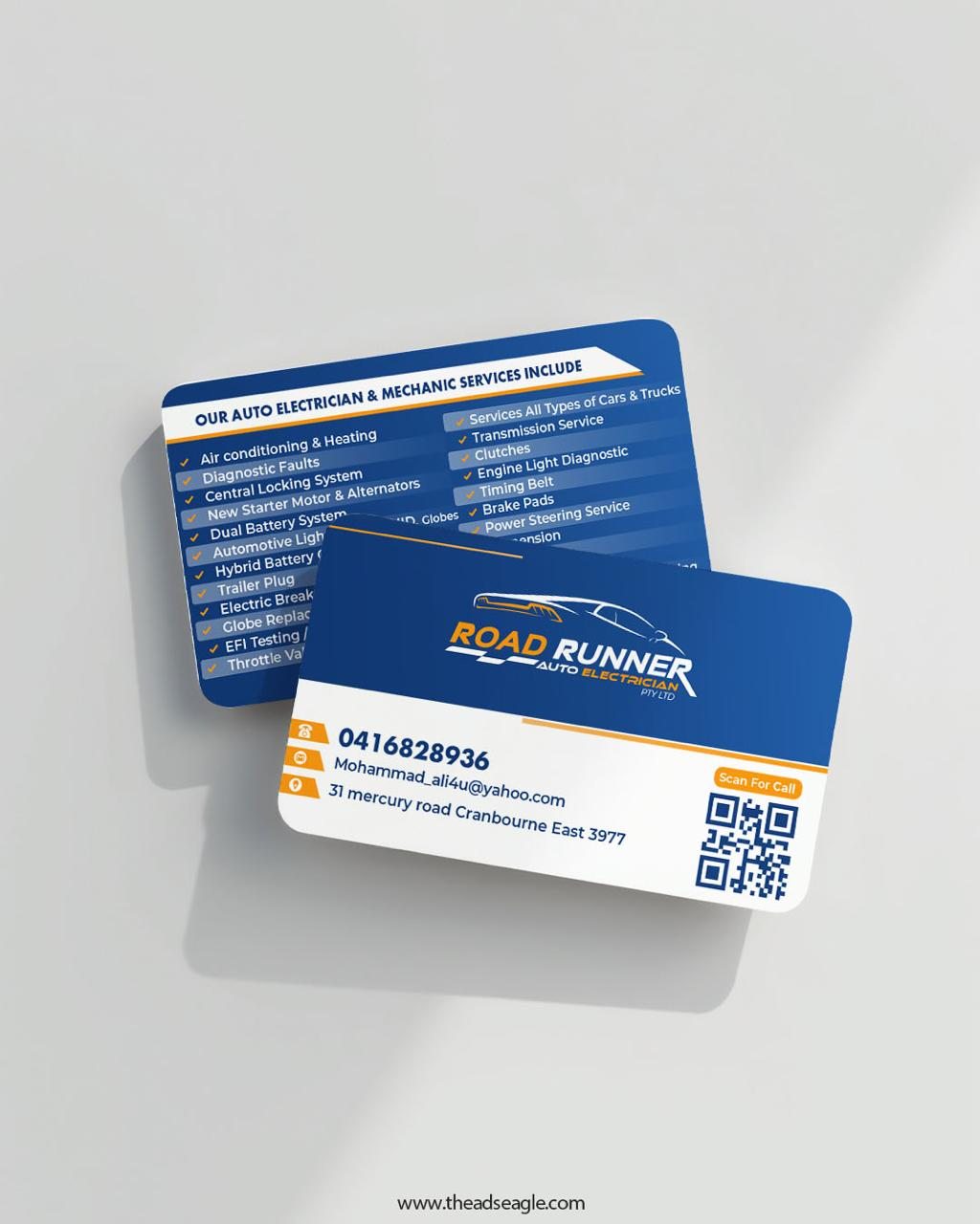
- Print-ready business card artwork
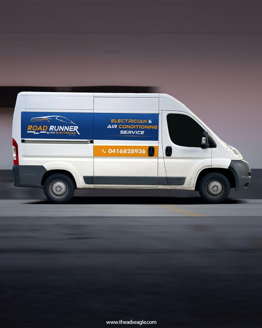
- Vehicle livery drawn for legibility in motion
- Usage rules for spacing and minimum size
Related
Want the same for your business?
This was a logo design and branding project. We also build the website and run the campaigns that put an identity in front of people.