The brief
What they asked for, and what we built.
What the client wanted
An identity for a sports brand that would read instantly as cricket, work embroidered on kit as well as printed on packaging, and hold a letterform the business could use on its own.
- A monogram that works without the wordmark
- A mark that survives embroidery and screen print
- A palette with enough contrast for kit and signage
What we did
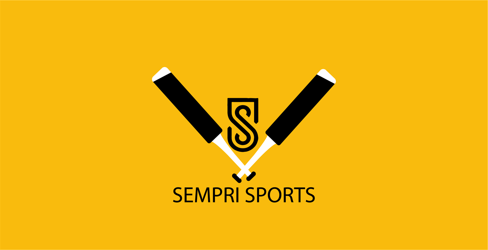
We built the mark around a crossed-bat lockup with an S monogram set inside a shield, so the brand has a full badge, a symbol and a letter that all belong to the same drawing.
- Crossed-bat badge with the S monogram
- Standalone monogram for kit and merchandise
- High-contrast yellow and black colourway
- Single-colour version for embroidery and stamping
Related
Want the same for your business?
This was a logo design project, part of our design and branding service. We also handle graphic design and video editing for launch campaigns.